Thursday, July 19, 2007

CHA - Distress Palooza
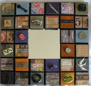

It's CHA Chicago time and Thursday is Education day. I've taken two classes and the one above is perhaps the best project I've ever seen. Taught by Tim Holtz with assistance from a heap of Ranger Design team members and the wonderful Robin Beams, this was such a cool project. There was no cutting, no messing around doing anything but the fun stuff.

We got to try out the new Tim Holtz line of Distress Crackle Paints - great stuff - a one step crackle process anyone can do. The brush is in the bottle and they're available in all 24 of Tim's Distress Ink colors - something to put on the shopping list when they're released later this year.

We also used Glossy Accents as glue - who knew it worked as a glue - it's dimensional and works a treat. The photo speaks for itself everything is stuck firm in just a few minutes and, believe me these were very lumpy accents and not flat backed.

Tonight I'm doing a Memory Glass class - I've done some work with it before but never a focused class. I'm looking forward to it.

Helen

Labels: , ,

Friday, April 20, 2007

Tim Holtz - tips from the expert...


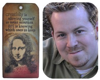
In the world of scrapbooking, Tim Holtz stands out from the crowd. Not only is he the most well known man working in a field dominated by women but he's an all round nice guy too. Corner Tim for a few minutes and you'll find he's full of enthusiasm for the craft and loves sharing his knowledge.

Tim is best known for his signature range of 24 Distress Inks which vary from sepia toned browns and dusky pinks, blues and greens to the newer brights with fun names like Spiced Marmalade, Brushed Corduroy and Broken China. As Tim says, "it's not just about brown anymore". When pressed, Tim admitted his favourite name in the new colour range is Shabby Shutters but he adds that Worn Lipstick reminds him of grandmother's lips when she kisses you and it leaves a lipstick mark on your cheek.

To go with the original line of Distress Inks, Tim and the crew at Ranger have developed a line of Distress Embossing Powders. I asked Tim if he had any tips or techniques to share when using thest powders, not unexpectedly, he did!

Tim points out that Distress Powders are different to regular embossing powders in that they melt to a matte finish rather than the usual gloss finish. They have a rough texture when they’re embossed and the release crystals that they contain cause parts of the embossed area to “rub off” when cool to give a distressed result.

To emboss in colour, Tim suggests you apply Distress Ink or Embossing Ink to your stamp and stamp the image. Shake the Distress Powder in the jar and apply the powder over the stamped image. Remove excess powder and return it to the jar. Heat the embossed image with a heat gun – the colour of the powder will change and it will feel like sandpaper when cool.

To distress the image, wait until the embossed image is completely cool then gently rub it with your hand to remove the release crystals. Discard the release crystals and, for an even more distressed look, Tim says “scrape away more of the powder”.

To distress your project even more, apply Distress Inks to a Cut n’ Dry Foam piece and rub the inked foam in a circular motion beginning over the edge of the image and pull the ink onto the paper to fill the inside of the image. You can also use Cut n’ Dry Foam to ink the edges of the paper – work from light to dark colours to make image “pop”.

Labels: , ,

Tuesday, February 6, 2007

Great news from Ranger Inks

I love Ranger inks but it wasn't until I interviewed Tim Holtz a couple of years ago that I discovered that the company's Sea shells, Sea Brights and Adirondack inks were arranged into a complimentary palette of color - who knew? Not me!

It seems that if you took Peach Bellini, Popsicle Orange and Terra Cotta inks - one from each of the range, they work wonderfully together. In fact, I still have one of their promo sheets on which Tim Holtz circled the colors to show just how they work. I lived by that list for a couple of years but I don't have to any more.

Ranger has, at last, acknowledged that most crafters don't know how the inks coordinate so the company has made it simple for all of us. Now the Sea Shells and Sea Brights are gone and they're all called Adirondack inks (I still can't pronounce that word, but at least I can now coordinate the inks). The inks are arranged into groups called Lights, Brights and Earthtones. The colors are the same but they're easier to match up with each other.

For the Earthtones collection which are the darker colors in the range, there are matching Acrylic Paint Dabbers, Dimensional Pearls™, Color Wash™, Alcohol Inks, Embossing Powders and Pigment Pens. So many wonderful products - Yum!

A by product of this rearrangement is the retirement of a few older products but you'll love the ease of coordinating colors - imagine paint,ink and embossing powders that all go together.

Find out more about the new range here: Ranger inks

Labels: , , ,