I love Ranger inks but it wasn't until I interviewed Tim
Holtz a couple of years ago that I discovered that the company's Sea shells, Sea Brights and Adirondack inks were arranged into a complimentary palette of color - who knew? Not me!
It seems that if you took Peach Bellini, Popsicle Orange and Terra
Cotta inks - one from each of the range, they work wonderfully together. In fact, I still have one of their promo sheets on which Tim
Holtz circled the colors to show just how they work. I lived by that list for a couple of years but I don't have to any more.
Ranger has, at last, acknowledged that most
crafters don't know how the inks coordinate so the company has made it simple for all of us. Now the Sea Shells and Sea Brights are gone and they're all called Adirondack inks (I still can't pronounce that word, but at least I can now coordinate the inks). The inks are arranged into groups called Lights, Brights and
Earthtones. The colors are the same but they're easier to match up with each other.
For the
Earthtones collection which are the darker colors in the range, there are matching Acrylic Paint Dabbers, Dimensional Pearls™, Color Wash™, Alcohol Inks, Embossing Powders and Pigment Pens. So many wonderful products - Yum!
A by product of this rearrangement is the retirement of a few older products but you'll love the ease of coordinating colors - imagine paint,ink and embossing powders that all go together.
Find out more about the new range here:
Ranger inksLabels: Adirondack, Dye Inks, Ranger inks, Tim Holtz
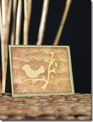
 Here is a fun card that I designed which makes use of a masking effect to keep the stamped bird from being stamped or inked over. It is simple to do and it lets you turn a single sheet of cardstock into a great card by simply stamping and inking it in layers, bird first!


